What is “Above-the-Fold?” … and RULE OF THREE?
If you have a website, you need to know what your ‘ABOVE-THE-FOLD’ is … otherwise, you might be dooming your website from the very first visitor. In this blog post, I’m going to tell you what your ABOVE-THE-FOLD is and why it is so important.
HINT: It has nothing to do with middle-aged muffin tops or hi-waisted jeans 😂 .
What is “Above-the-Fold?”
The above-the-fold is the area of top section of your home page that a visitor can see as soon as they land on your website (no scrolling). If you scroll so you can see more, you are no longer in the above-the-fold. The above-the-fold area is limited to ONLY what you can see when you first land – no scrolling or adjusting the screen.
The above-the-fold area is super duper important because it is the first thing a potential customer sees when they get to your site. It’s prime real estate and you want to make sure you design it right to increase the chances that your visitors will stay longer, keep scrolling and learn more about you (don’t worry, I’m going to tell you how – keep reading!).
Get your above-the-fold area right and your warm leads are inching closer to calling or buying; get it wrong and adios amigos, you have just lost your visitor and potential customer possibly forever!
What is the purpose of the above-the-fold area?
As I have mentioned, the above-the-fold area is really important. When people land on your site and see the top of your home page, within 3 seconds you want to make sure they know what you do, whether they are your ideal client and what they should do next. You want to make the visitor feel like you are inviting them in and talking directly to them. You want to get their attention right away so that they want to read more and start to scroll.
How Do We Make The Above-The-Fold Section Awesome? THE RULE OF THREE!
I have created an easy way to remember what to include in your Above-the-Fold section – it’s called THE RULE OF THREE. There are three things you absolutely need to include on your Above-the-Fold; they are:
#1: An awesome picture of you.
People want to see who they’re going to be working with.
#2: A Headline & A Little Bit of Text
These words should grab their attention and tell them what you do. Don’t be cute or too vague or obscure. Remember, they should instantly have an idea about what you do and who you serve. To check out my Above-the-Fold, click HERE.
#3: A Call-to-Action
A call-to-action is an invitation to do something. You want to tell the reader exactly what their next step is; it’s sort of like providing them a roadmap for what they should do next. Think about what you want the client to do next OR what information the client usually wants to know first. A few examples of a call-to-action for your above-the-fold area may be:
- Book A Call
- Shop Now
- Learn More About What I Do
- Check Out My Services
So there you have it! You have learned a lot in this article. You’ve learned all about what your website’s above-the-fold is, why it’s important and the RULE OF THREE for what three things you need to include in this high-stakes area. Good Luck and if you have any questions, feel free to email me at tracy@kitchentableceos.com.
While you’re thinking about your website, you may want to check out this article: “How To Protect Your Website With One Vital Piece of Information.”
From my kitchen table to yours,

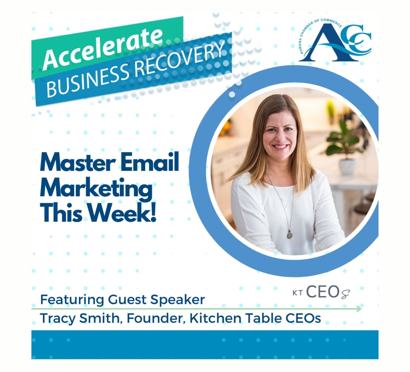
Kitchen Table CEOs is a boutique agency specializing in online marketing for solopreneurs and small businesses. Owner Tracy Smith helps you create the content, brand, and online presence you need to launch and grow your business with confidence and ease. Kitchen Table CEOs can design and develop your website, create your business story, write all of your content, and launch your email marketing. For more information on services, please CLICK HERE.


