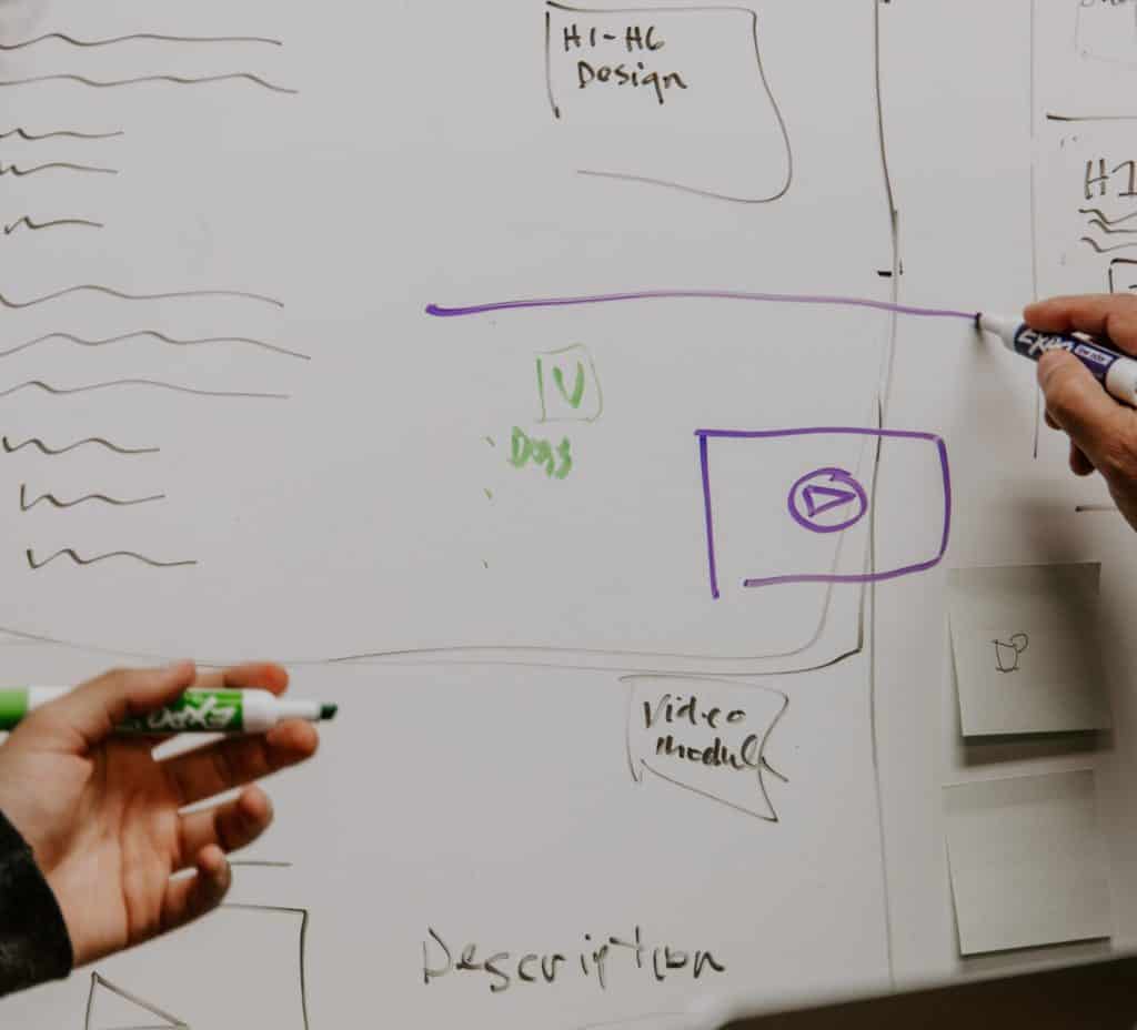
The #1 mistake female entrepreneurs make when embarking on a new website is to skip the website planning process. The planning process is critical if you want a website that is not only professional and drives sales, but is also enjoyable for the reader.
The website planning process includes:
- Mapping out your site
- Determining what pages you require
- Creating a wireframe of your home page
- Deciding on brand colours, fonts and final logos
- Thinking about what you want your website visitors to do and where you want them to go
IS YOUR WEBSITE A YAY … OR A NAY?
TAKE THE QUIZ AND FIND OUT NOW.
I can’t tell you how many times a fellow entrepreneur has come up to me and asked:
‘How can I improve my website?’
OR
‘Can you take a look at my home page and tell me if it’s okay?’
Well those are loaded questions! When I go and check out their sites, one thing is often abundantly clear: there was no overarching website planning or website strategy that went into creating their site. How do I know?
TELLTALE SIGNS THAT SOMEONE SKIPPED THE WEBSITE PLANNING PROCESS?
- The site is missing standard pages, such as an about me page, contact page or services page
- The home page follows no specific flow or pattern and feels like it’s just throwing various pieces of information at the reader
- There are no call-to-actions telling the reader what to do or where to go next
- The home page highlights only one or two pages on the site or repeats itself, instead of highlighting the entire site, giving the reader a sneak peek of everything they can check out
- There is no consistency when it comes to colours, fonts, formatting; and it’s really clear that some sections have been added on or written by a different person
- There are different themes and templates being used with no consistency i.e. some round buttons, some square buttons, etc. some stripes, then polka dots.
- The site is a stressful experience, hard to read, and/or riddled with mistakes
Okay, so enough about mistakes and signs a website has not been designed or developed in the right way. If you’re thinking you want to create a website this year or maybe you want to do a huge overhaul of your current site, here are some musts for planning out your website the RIGHT way.

When You Plan Out Your Website, Ask Yourself These Questions:
1. What pages should you include in your website?
I recommend: Home, About, Services/Products, Contact, at the minimum
Extras: FAQs, Media/In the News, Blog, Portfolio, Testimonials
2. What is it that you want website visitors to do when they land on your home page?
Make sure this is your main call-to-action on your ‘above-the-fold’ section (the area they see when they land on your site and have not scrolled.
3. How are you going to collect visitors’ email addresses?
Email marketing is imperative so think about how you can incorporate email marketing into your website. Will you ask them to subscribe to a newsletter? Offer them a freebie?
4. How many services or products do you offer?
If more than 3-5 services, how are you going to organize these items so that visitors can easily find them?
5. What colours are you going to include on your website and how are you going to use them?
Too many colours can be distracting and overwhelming, too few can be boring and look too simple.
I recommend having 2-3 neutral colours that you use plus one brighter/bolder accent colour. Do a quick google search for ‘website template colours’ to get some inspiration of how to make this decision.
6. What fonts are you going to use?
I recommend one type of font for your headings (bigger and bolder), the same one for your subheadings (a bit smaller and bolded), and a second font for your paragraphs (easy to read and sans serif). Do a quick google search for ‘popular website font pairings’ for ideas of what may work really well together.
7. How can I ensure that my website looks good on all devices, not just computers?
8. How will you layout your home page to tell your visitors exactly what you do, who you are and how they can find out more information on what you offer, and/or contact you?
They shouldn’t have to look too hard. This is probably THE most important step. Please do not assume you can do this without any training or research. Please look into sample home page layouts. Oftentimes, we purchase templates and fill in the blanks without knowing exactly what the purpose is of each section. This is when you create your wireframe.
What’s A Wireframe?
A wireframe is a very simple layout of a website page (can be sketched or created in a computer program) and should be done before you begin creating or tweaking your site. Simple pencil to paper will do just fine; no colour or images, just boxes and symbols indicating where images will go, where text will be placed and where buttons will be. Click HERE for an example of what a wireframe looks like. Using a pencil and paper, you can plan out your home page and create a wireframe. Layout your page in horizontal sections, each one featuring something different (or talking about an area of your business) and each one with a different call to action.
If you’re not sure where to start, book a complimentary call with me so we can chat about your website and get you headed in the right direction.
If you want me to review your website and provide you with a comprehensive report on where you are at and what needs to change on your current site, click HERE.
And if you want more useful information to help you with your website, I recommend reading “10 Tricks to Make Google (& Your Readers) Love You”
From my kitchen table to yours,

Tracy Smith is a professional copywriter, brand strategist and the Founder of Kitchen Table CEOs. Through tips, writing templates and one-on-one consulting services, Tracy helps women entrepreneurs create the content, brand and online presence they need to launch and grow their business. For more information on her services and how to work with her, please click HERE.


